
Bruno Munari, colors and the beginning of a new perspective
- Amanda Braga

- Jun 13
- 4 min read
I had barely started studying Architecture when I was already impacted by two unexpected encounters: Bruno Munari , with his almost poetic methodology. And colors , which gained new layers in my gaze.


Before I started my undergraduate degree in Architecture and Urban Planning, I already had a solid background in graphic design. Accustomed to briefings, brainstorms, mind maps and creative flows, I thought it would be a quiet semester, and in a way, it was. But it was also much more profound than I expected.
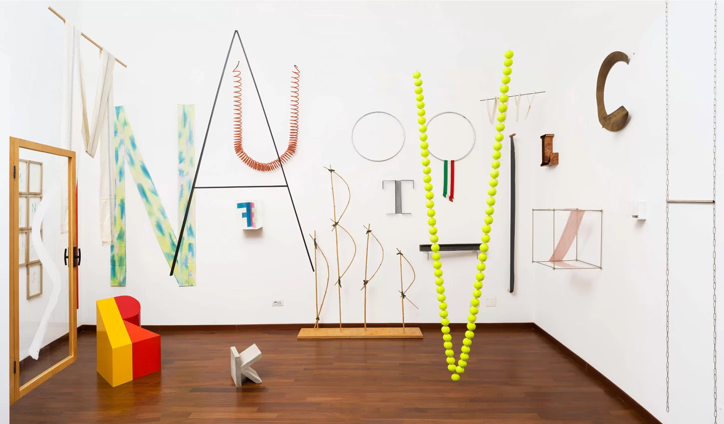
In the Project Methodology course, I was surprised to rediscover many of the tools I had already used as a designer. But something stuck with me even more: Bruno Munari's methodology.
The clarity, simplicity and, at the same time, the depth with which Munari organizes the creative process was a turning point for me. The way he disassembles the project into parts, rebuilds it with intention and translates ideas into function... it was like hearing in words everything that I have always felt in practice. You know when something makes so much sense that it seems like it has always been with you, but you just hadn't named it yet? That's how it was.
It was there, still in the first months of graduation, that I developed one of the most intriguing projects of the semester: giving new meanings to a simple everyday object .
I chose a glass cup.

Simple, transparent, functional. But, by applying the steps of Munari's methodology (observation, disassembly, reconstruction and reinvention), this cup was transformed. Little by little, it stopped being just a container. It began to gain new possibilities, new purposes, new stories.

I analyzed its shape, explored alternative uses, and imagined versions that challenged its original function. Instead of containing, it began to sustain. Instead of storing, it began to reflect. It was as if that small object silently carried a universe of ideas waiting to be revealed.
There, with a glass in my hands, I understood the power of creative deconstruction. And how, when done with intention, it is not just aesthetics, it is thought in action.
But the biggest turnaround came in Visual Expression .
It was during this study that my perception changed, and not in a theoretical way, but almost as a sensory experience. The relationship with colors, which was previously primarily technical, became something much more emotional.
Until then, my color choices, both in design and in the imagination of environments, mainly followed this logic: neutral, cooler, discreet tones. I sought restrained elegance, timeless sobriety.
But for the first time, I found myself investigating a different perspective. In class, we were guided by chromatic harmonies with an artistic, almost sensorial perspective. And something in me changed.
I began to admire contrast even more. I began to look at the vibrant with a certain interest. Warm colors, bold combinations, atmospheres that say “I’ve arrived”, all of these started to have a place in my repertoire.
In our team, fate chose green to be the protagonist of the analysis, and it was Pantone's Kombu Green that won us over, still bringing to the surface the ideas of elegance and sobriety.


But still, it’s a green. And this deep, earthy green isn’t just a color; it’s a feeling, a story that pulses between nature, refuge and calm .
We created harmonious palettes full of contrast and harmony, and that's when I really started to realize how a color can communicate emotions, transform an environment and gain new nuances when combined with other tones that completely change its perception.


This exercise became an invitation to look beyond the surface: color is not just style or sensation, it is pure narrative . It can be told in different ways, in an environment, according to the chromatic arrangement that accompanies it.
I, who come from a graphic design background, already understood the technique and usability, but now I see that colors convey sensations in spaces that profoundly impact those who experience them .
And this discovery completely changed my way of thinking about projects: a learning that I carry with me and want to explore more and more.
My Pinterest boards, which used to be minimalist, neutral and tending towards monochromatic, now have shades of blue, yellow, earthy orange, pink, red, black and more... compositions that I would never save before. I still love neutrals in soft tones. But now, I know that they can coexist with visual impact , and that this contrast, if well constructed, can be as moving as it is welcoming.


Even with my years of experience in digital design, it was during this semester that I truly understood the sensory and emotional power of color when applied to physical space . It’s not just about style. It’s about sensation. About behavior. About creating atmospheres that transform the experience of those who live there.
Today, I look back on this experience and see: this first semester was not just an academic beginning. It was the beginning of a new perspective.
A look that opened with Munari, gained color with visual expression, and now moves between the graphic and the spatial with more awareness, more intention and more emotion.
Nothing like starting from within: a semester, some new perspectives… and a new way of seeing design and architecture.
My Pinterest references are open: if you want to explore the same images, colors and atmospheres that have been inspiring me in this process, I'll leave the link here with love. Maybe something there will spark something in you too.


Comentarios